Multimedia Story Final
For my multimedia story, I wanted to explore the most unassuming places of Victoria and document the odd, and unexpected design choices that exist throughout the city. Victoria is often seen as beautiful and historic city but when you look at it from a different lens there are so many interesting artistic designs that we often miss. Rather than focusing on the postcard worthy locations, I instead drove/ walked around Victoria looking at buildings, murals and unusual pathways and found so many architectural details that felt unusual or visually interesting. I want to walk about how with visual exploration we can see how design changes over time and how much personality exists in every corner.
Adventure Time (ノ◕ヮ◕)ノ*:・゚✧
I choose to not give myself a strict timeline to find these pieces of media. I used my phone and camera to take photographs and capturing short video clips as I was driving. I then used my iPad to draw and highlight some of the reactions I had to certain buildings.
I was responsible for my own safety and in order to make sure everything works out I stayed in public areas, took photos from sidewalks or from inside my car, from inside my car while it was moving I had my friend help capture the photos as I drove. The adventure was approximately a few hours spread throughout several days I wanted to take my time finding something visually interesting.
Walk with me! (●´ω`●)
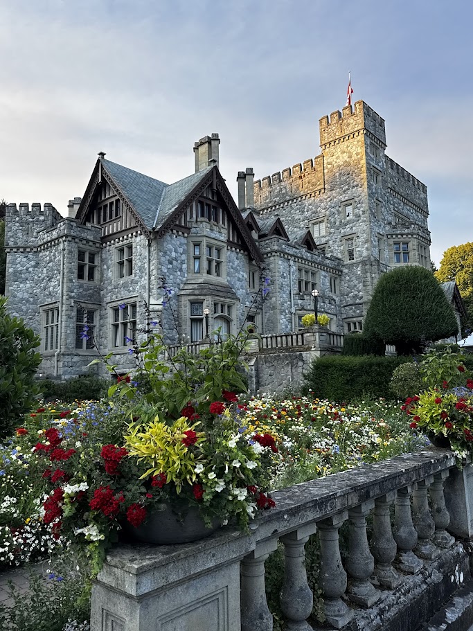
Photo 1: Hatley Castle
Of course if we are talking about Victoria, we have to talk about the historic and older buildings. This is Hatley Castle. It was a beautiful walk around with an expansive garden and column covered walk way, it was absolutely beautiful and mesmerizing. It makes me ponder all the history of this building and how much maintenance it takes to keep it pristine. The architecture is so interesting, everything is seamless but very unusual to what we see now, with full brick/ stone walls, multiple roofs and square OPEN! railing roof.
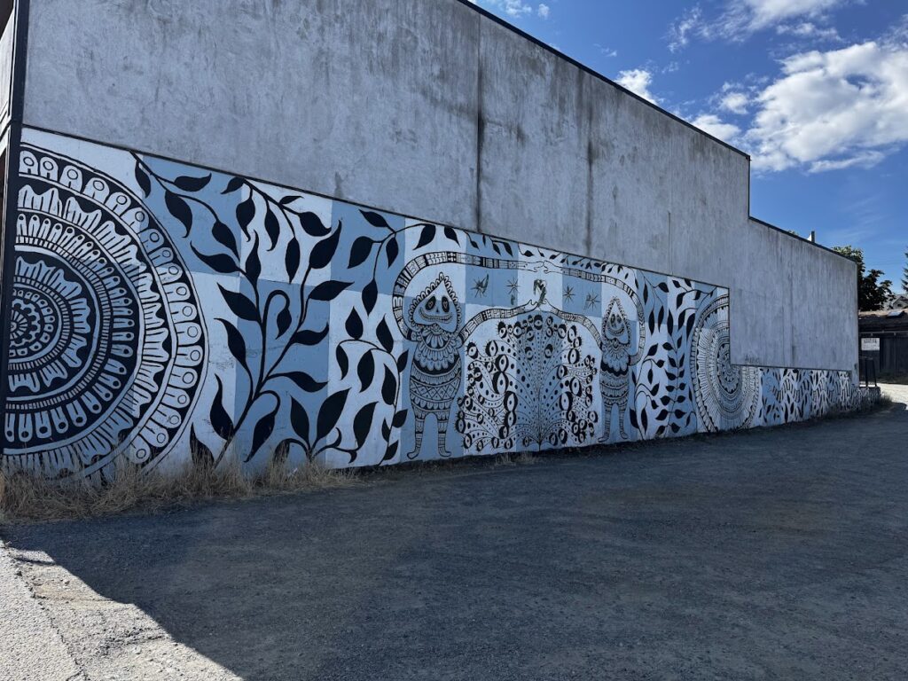
Photo 2: Mandala-sque Mural
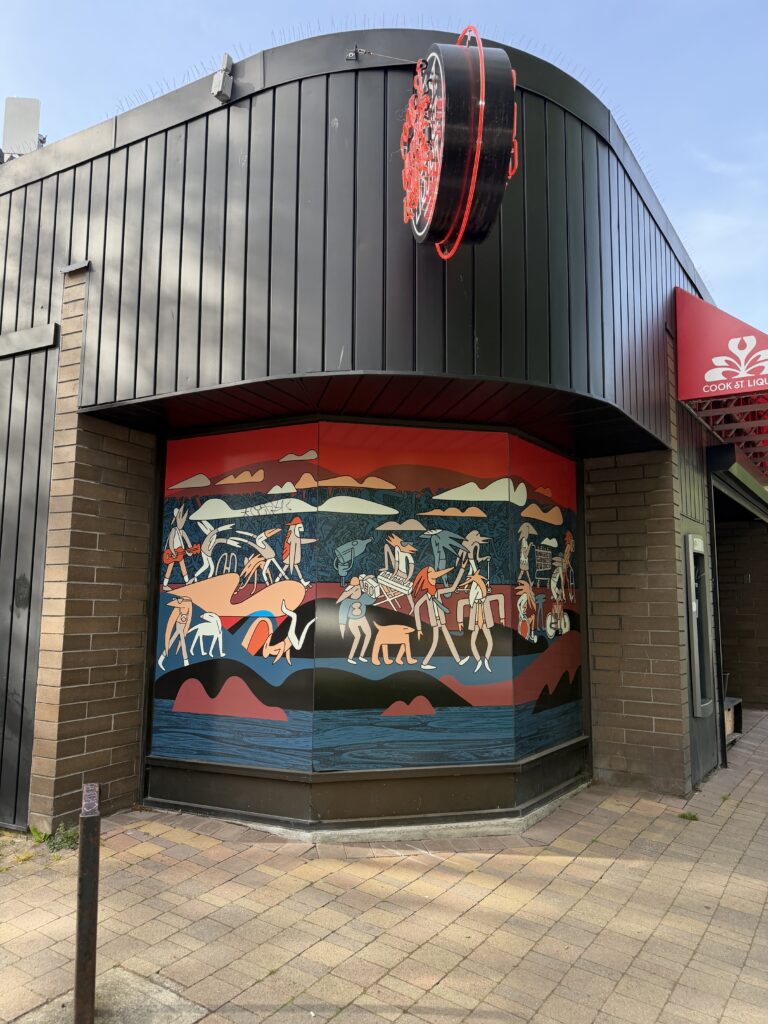
Photo 3: Storefront Mural
As we walk we see many, many different styles of murals and different signs that signify the artistic style of the community and store owners. I saw so much personality and was amazed by the stories these murals tell us readers.
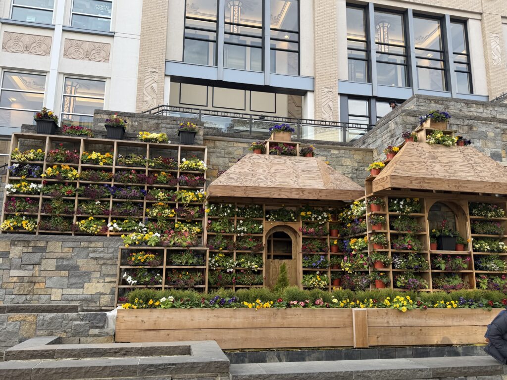
Photo 4: Flower House
Even further, as I walk around and get refreshments at Walmart, we see this gigantic installment, I believe this installment is gone now but it was a beautiful looking at how they incorporated plants and flowers into this ‘house’ they created.
Driving Adventures ⛐♬⋆.˚
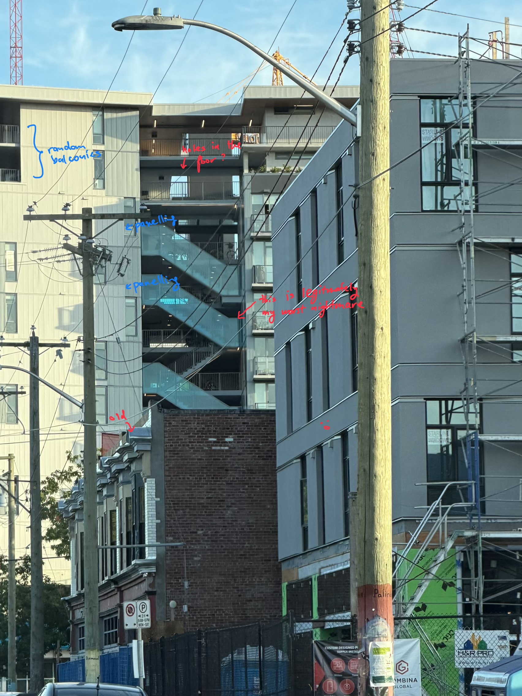
Photo 5 & 6: Floating Staircase Apartment Complex
This building just keeps getting long as I drive, such an unusual and honestly terrifying design. It seems to be an apartment complex with floating staircases. If it was only few levels it wouldn’t been so bad but it is very tall building. Not only that it is very interesting to see very modern and exposed style, turning movement into a visible part of the building. Also seeing the juxtaposition of a modern/new building with older buildings with a ‘outdated’ design in the foreground seemingly gated away for future demolition.
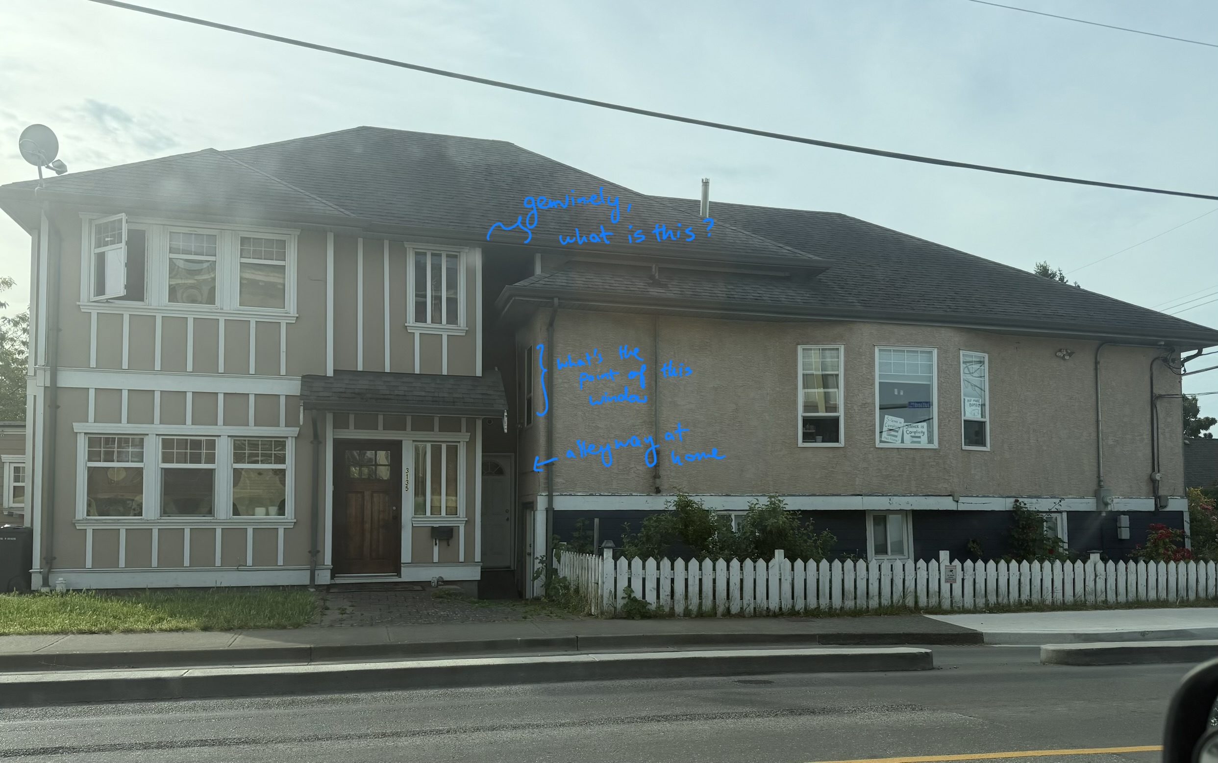
Photo 7: House on a House
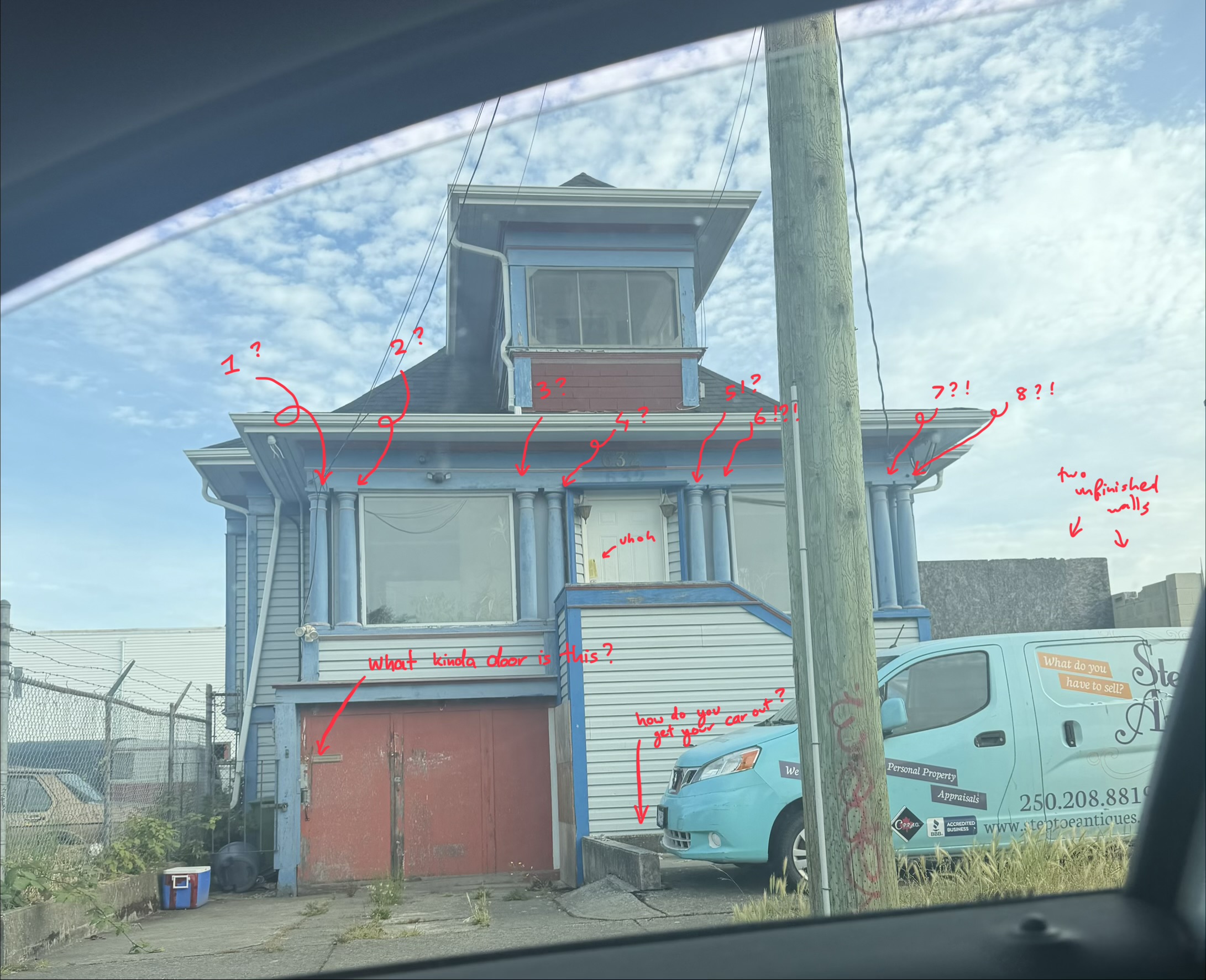
Photo 8: Column House
With residential areas, we see many beautiful communities and homes that we can see people put a lot of effort into it. Separate from that we see houses that have very interesting architecture.
Exhibit A & B, firstly we see a house that seems to have gotten another house added to it; extension if you may. It is a bit funny as there is there is little to no space for the front door. Because of this new addition there is now an arbitrary window with a nice view of the wall.
Next we see a house being supported predominately by columns?? I have genuinely never seen these many columns in one building. So funny to imagine the installment and discussion about floor plans.
Applying Mayer’s Principles of Multimedia Learning
I know this project may seem like a random collection of images, to make sure it makes sense I tried to think about Mayer’s Principles of Multimedia Learning.
Coherence Principle
This principle speaks about the removal of unnecessary information so that the audience can focus on the main idea. I chose images that connect to my theme of unusual or interesting design choices in Victoria. I didn’t include every photo I took because too many unrelated images would make the story feel confusing. Instead, I focused on images that showed architecture, public art, age, or contrast between old and new design.
Signalling Principle
This principle talks about guiding the viewer’s attention toward important details. In this story I wanted there to be a discussion so I used captions, labels and arrows to highlight sections that would otherwise be overlooked. This helps the audience to understand why I may want to show and talk about the interesting image I captured.
Spatial Contiguity Principle
The spatial contiguity principle means that related text and images should be placed close together. In my post, I placed each caption directly under it describes. This way, readers don’t have to guess which part of the writing connects to which photo.
4. Segmenting Principle
The segmenting principle means breaking information into smaller sections so the audience can process it more easily. I divided the story into sections such as older buildings, playful public art, modern architecture, and strange small details I found along the way. Makes the project easier to follow and gives the reader time to understand each theme before moving to the next one.
Personalization Principle
As the name suggests this speaks about personalizing information allows the reader to learn more effectively. In this project I described from my perspective and my ideas that apply to these different facets.
⠀⠀ ⠀⠀ ⠀⠀ ⠀ ⠀⠀ ⠀⠀ ⠀⠀:¨ ·.· ¨:
⠀⠀ ⠀⠀ ⠀ ⠀⠀Reflection `· . 𐙚
The feedback I received talked about how my draft was a tad too short and how final project needed to clearly show that I could produce a multimedia story and explain how it aligned with Mayer’s principles. So in order to do so I incorporated this feedback by spreading the information throughout and making a more complex discussion. I added more images and media that connected to Mayer’s principles more explicitly. Many of the challenges I faced were travel, so many hours were spent trying to manveur the traffic and getting photos of places without infringing on people’s public photography rights (i.e. I didn’t want to take photos of other people without their permission). Also was deciding that counts as “interesting”, Victoria has many beautiful and unusual spaces, so it was easy to take too many photos. To overcome this, I focused on places that had a strong visual personality or showed some kind of contrast.
This project was very refreshing, seeing different places and looking at it from a different lens made it a very educational trip. As I took photos, the process became more about noticing how time leaves marks on a city. Some buildings were acting as a preservation of history while others were moving to be more modern. And lastly are the buildings that evidently had builders who wanted to try something new. I learned to be unbiased and look it as designs that are imperfect but still meaningful. A strange balcony, a mural on a plain wall, a colourful storefront can all say something about a place. All places that are unassuming but evidence of human expression and our adaptive nature.
Honorable Mentions!
I wanted to show a house I saw on my trip to Comox; a house with an entire boat integrated into the structure. It would be disappointing if the homeowners didn’t own a boat.
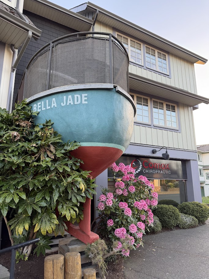
Photo 9: Boat house (literally)
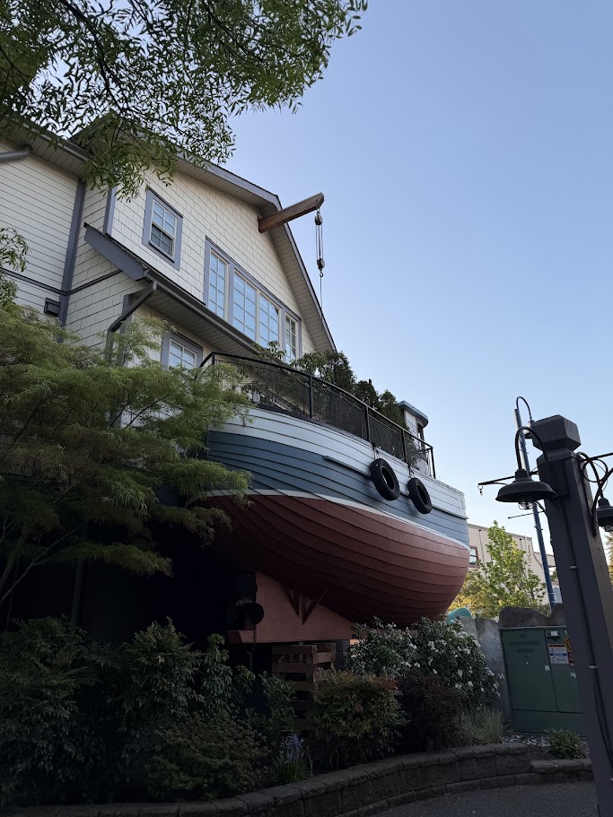
Photo 10: Second Boat house (Can’t believe I found two)
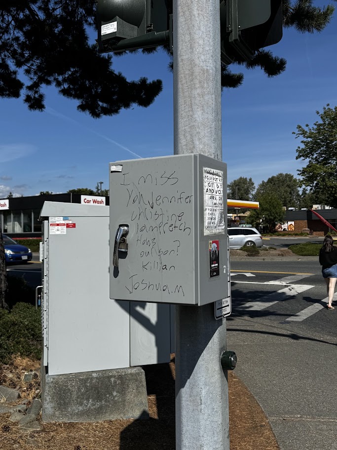
Photo 11: what?